Overview
Define a scenario where you log into your account, see your balance/points, then make a payment towards your credit card bill.
Understanding the Problem Space
People rely on their banking app very heavily, sometimes using it everyday. When dealing with people’s money, you want to make sure you give the people what they want; an easy, aesthetic app that provides what they want with very little to no inconvenience.
Identifying the Opportunity
“Age has some impact on who is downloading financial apps; 64 percent of Millennials and 59 percent of Gen Xers have a full-service banking app on their phone and only 41 percent of respondents older than 55 said the same.” -(BIZ Journal)
Currently this app has a 2.4 out 5 stars with 1,234 ratings on the Apple App Store. It is also currently #64 on the finance app charts. Barclays operates in over 50 countries and employs approximately 140000 people worldwide. (Barclays About)
Strategy
Finding out the biggest pain points of using this app, through personal use and interviews
Research successful mobile banking apps and see what is working.
Design an intuitive mobile interface to quickly view transactions, pay bills, use miles, etc.
Research
Interviews
3 interviews with current Barclays App users to understand want they want and what is needed.
Pay a credit bill based on their current balance, …etc. with no confusion.
Select a date to pay a bill with simple suggestions
Pain Points
Have a menu to use that is useful and relevant
Noticeable Quotes
“The biggest issue for me is not having ‘current balance' be an option when paying a bill” -Sarah P.
“I dread going onto this app because of the lack of design and convenience”- Ian H.
Insights
Creating reinforcements
Enjoyable/recurring motives
Positive experiences
Creating Transparency
Condense busyness on pages
Focus on the important function
Paper Wireframes
Final Solution
Ideations
Using Sketch software I was able to recreate the most important pages of the app. Very simple layouts that was very self explanatory for the user. I wanted to tackle the idea of creating a better experience of paying a credit card bill, without any frustrations.
Design Concepts
Redesigned Homepage
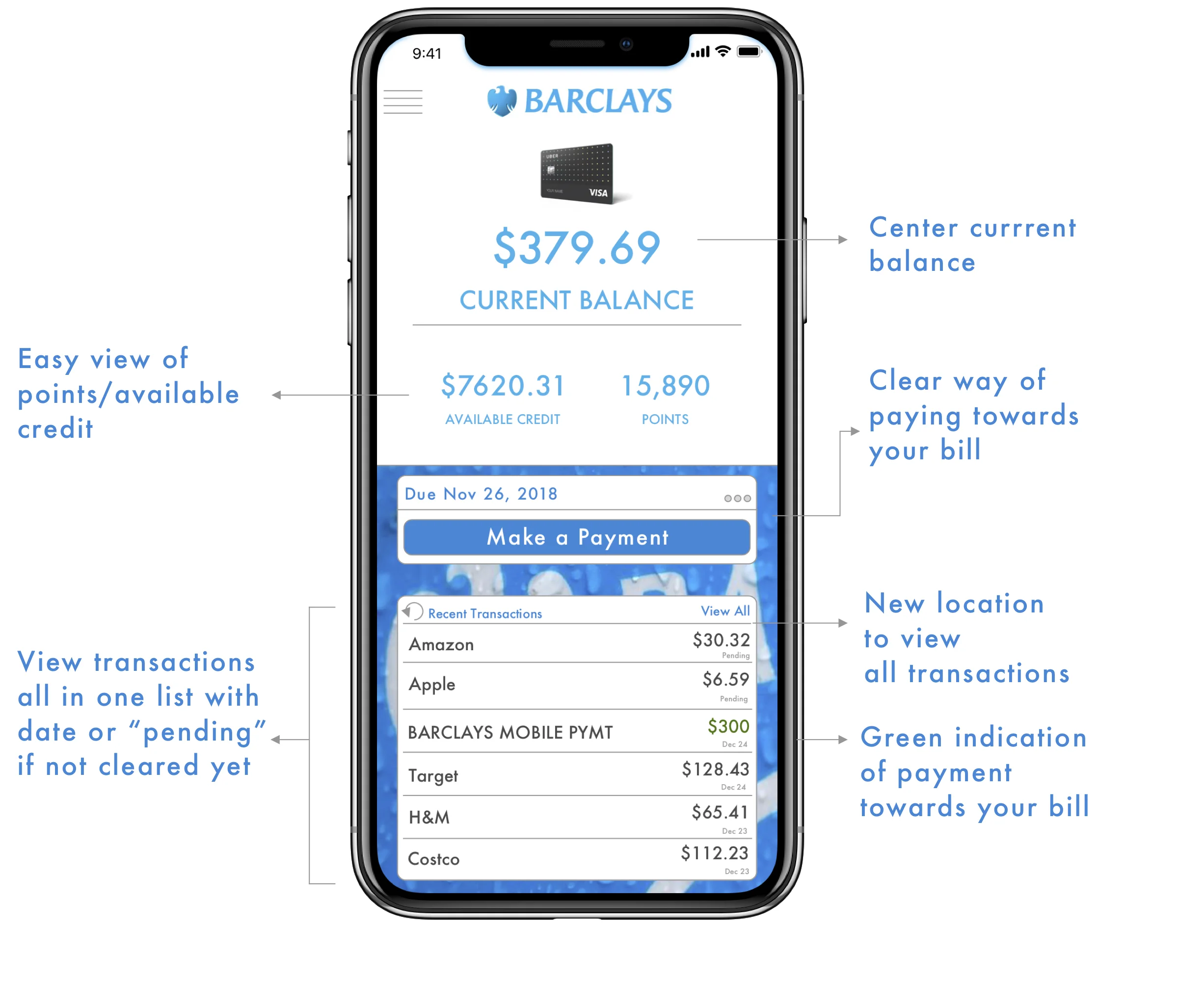
I wanted the aspect of paying a credit card bill to be simple, easy, visual appealing and self explanatory.
Clear hierarchy view of the current balance, available credit and points.
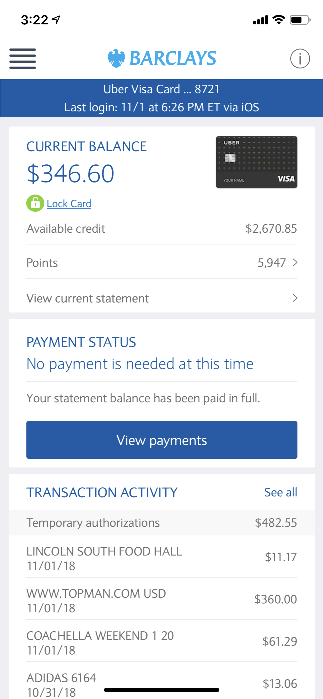
Having a “Make a Payment’ button on the home page vs. on a secondary navigation page (see before and after at the bottom of this page).
All transactions and payments are in one section and are clearly labeled with the posted amount and date, or labeled “pending”
New Barclays Wallpaper on the bottom half of the page to create contrast and increase visual aesthetics.
Making A Payment
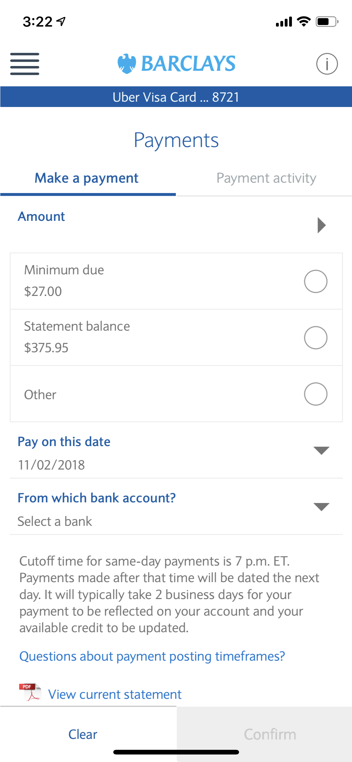
Instead of an accordian style list that clutters this page, having it go to a secondary navigation screen to the select amount of date of payment
“Slide to Pay” confirmation toggle to enhance user interaction, reduce the number of clicks to pay a bill and “accidental” payments.
'
Selecting Payment Date
I have the availability to select different dates to pay my bill with simple visuals that help you make your decision
Earliest Date
Due Date
Automatic Monthly Payment
A date of your choice
The original version only gives you a calendar to select a date.
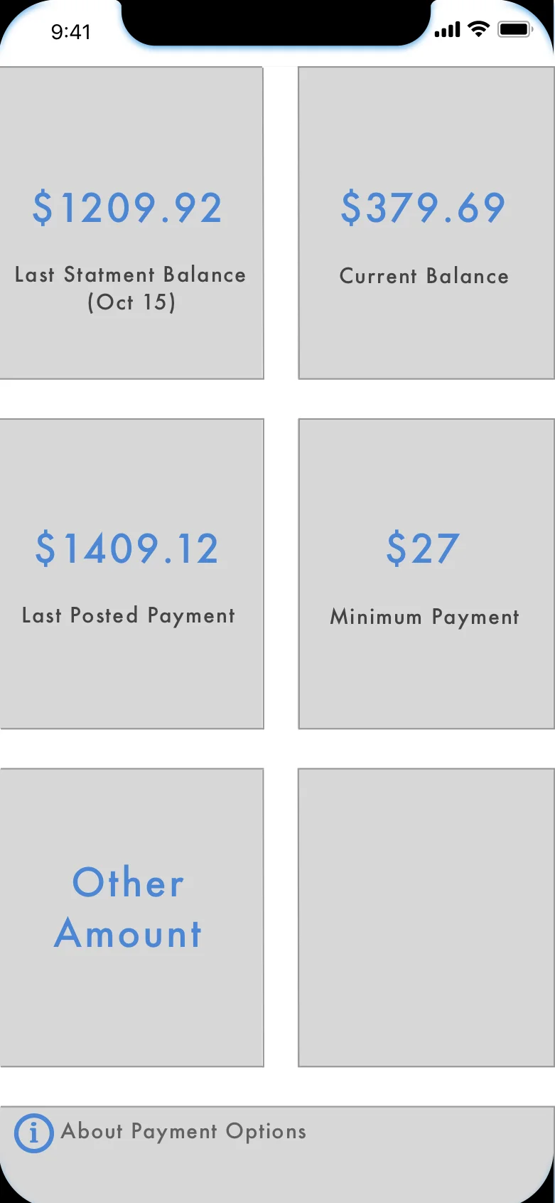
Selecting Payment Amount
Once again, I have the availability to select different amounts to pay towards my bill with simple visuals that help you make your decision.
Last Statement Balance
Current Balance
Last Posted Payment
Minimum Payment
Other Amount
The original version only has minimum due, and previous statement
New Menu Set up
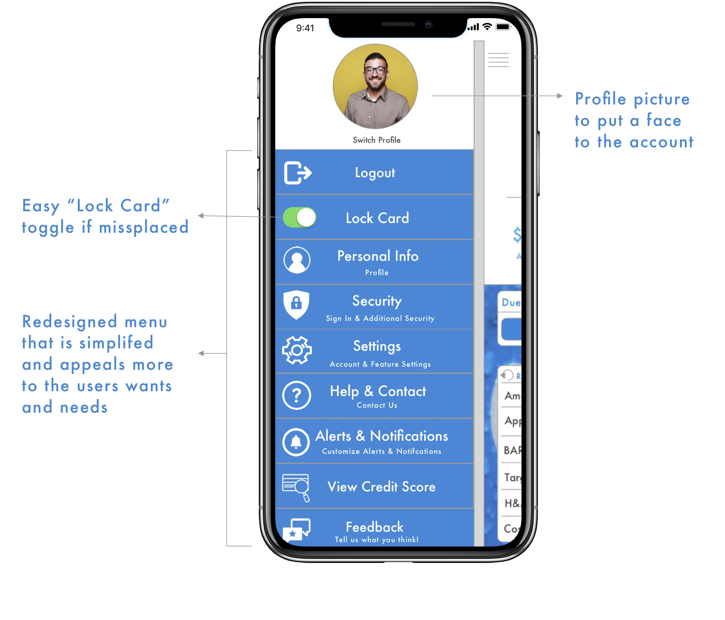
A completely redesigned the side pop out menu to make it more aesthetically pleasing to look at, incorporating the Barclays blue color and adding a profile picture to the account.
Next, I recreated a list of options, with icons, to select from and they reflect what the users actually want and need when going to a menu page of a banking app.
Lastly, I created a simple “Lock Card" toggle if you lose your card or leave it somewhere it is not supposed to be at
Before And After
Before
AFTER
Before
AFTER
Before
AFTER
Before
AFTER


